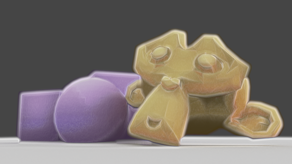
I’ve been experimenting for the last few days with more shaders, using Eevee in Blender 2.8. I started trying to replicate my previous compositing effect, then ended up doing something a bit different.
As I can’t use Dilate/Erode with shaders to get a soft edge, I used a Layer Weight node. I wanted to use the Bump node to modify the normals to gain control over how that turned out, using vertex paint to define which normals are bumped, but it ended up displaying incorrectly, so my current solution is to use vertex paint to add or remove colour from the initial appearance, with a second set of vertex paint to modify the shading. I like this method better than using modified normals; I can directly control it, rather than just having to change normals and hope the outcome is correct, or having to change them frequently depending on the lighting or model angle. However, unlike Blender Internal, I can’t currently get a difference in the shader between its own shadows and shadows cast on it by other things, so if I modified the shading for being ugly in an area shadowed by a second object and itself, it would erase the other’s shadow, looking incorrect.
But, if the AnimAll addon is upgraded to work with Blender 2.8, the vertex data will make it animatable, meaning I could easily fix shading every frame. Currently, that addon isn’t compatible with Blender 2.8, though.
I also used a small amount of bump mapping to add a little bit of inconsistency and texture to the models; complete perfection in the shading is a big tell of 3D. I also used a noise texture on the edges of the Layer Weight’s result, to make the imperfect.
I have to work more on this; I think it’s better to combine some of the vertex paint effects, for one. If I’m changing the shading, it should also effect the edge. As it stands, shding that’s removed doesn’t overwrite the original Layer Weight result, so it can cause areas to exist that look too dark next to modified shading. Also, I need to see how it works with different colours. Past experiments have shown dark colours, high saturation, low saturation, behave differently, so I may need to modify how strongly they’re visible according to those to make it look good. I’m making progress, though. I’ll also experiment with applying this to proper models instead of test models, since the purpose is to be actually usable.