I’ve had a bit of time off work recently. Unfortunately, I’ve been having to move my sleeping pattern around quite severely, so I haven’t been able to use it all as much as I’d have liked to; it’s hard to concentrate when tired.
Still, I’ve been progressing, I think. I’ve almost finished my model of TKB.
I spent a while testing out different methods to see if I could capture shading information separately to the silhouette’s vectors. Object based normals seemed to work, but don’t hold up from every angle. I don’t know how to fix that yet, urgh.
Modeling clothes and such was difficult…I’m not skilled with them. A lot of the time, they’d be sculpted with the creases and such on them already, but this is one I’d want to post in various ways, and they wouldn’t look natural when the creases would be identical in every shot. So I’m keeping the basic mesh simple, and then I’ll add those as and when I need.
I’m using colour masks to separate different colours. Using R, G and B separately, I can three colours for one image. I’m not good at painting on patterns and such, though. I’m very inexperienced with that.
As it stands, I’ve applied most of the shaders to him, but…It doesn’t look good to me, or like watercolour. Obviously, the shading needs correction, as I haven’t edited his normals yet, but it’s more than that. The silhouette is crap; they always need normal editing to become decent, and even then, it’s not as reliable as I’d like. What I really need is a two dimensional outline…Something that can just consider how it is as a flat shape, not something in 3d space. I could displace it using the camera, but I’d have to change that modifier every time I changed the camera. I need…Some way to filter out those details, to simplify the normals data it’s using. Normal editing works, but I can’t have a real set of normals for a silhouette and another real set for the shading. And it’ll look very 3d if the edge is so perfect without it.
I also did a bit of sketching. I’ve been testing out the Flatten brush. I usually use the Trim Dynamic brush, but the Flatten one seems more effective. I like to sculpt in a fairly planar way, so it’s good at that. I tried sculpting Heat, and retooled his sketch-head into Serph for fun.
I also practiced mouths. I think I have a better grasp now on how I’d like to model a mouth interior. I’ll try applying it to my next character models.
Recently, I’ve been working on a model of Thief King Bakura. I feel like I’m finally making some progress. I sculpted him using dynamic topology, and then dynameshed him to smooth out. I used a male base mesh I made, which I’ve saved for use on other models for time saving.
I’ve run into problems with clothes, though. I couldn’t get sufficient quality from ZBrushCore. They’d melt together, and elaborate clothing seemed borderline impossible. So, I decided to try ZBrush full. I’m currently using the trial version, and its features are very convenient. In particular, Zremesher. I had to faff around with it for a while to learn how to make it tick, but I seem to have a decent grip now. Apparently, the trick is to give it less strokes, not more, which tripped me up.
It seems the less, the better. The topology isn’t quite perfect, but very good, and a huge time saver. Up until now, I’ve been using 3DCoat to retopologise the body, then having to manually do the face and awkwardly fuse it on, which takes time and isn’t as clean.
I used this for Bakura’s model. But I’ve realised some mistakes I made while doing so. After retopologising him, I discovered ZBrush seems to only allow you to bake normals from a higher subdivision level to a lower level one. You can’t, apparently, bake from one subtool to the other. I had the high detail, dynameshed TKB model, and wanted to bake them to the low detail retopo TKB model which was a different subtool, and I couldn’t. So on this occasion, I had to bake his normals in Blender. I also couldn’t seem to get the UV Master to work for me. It may be intuitive for some, but I’d rather work with real topology. Manual control would be better for UV mapping.
Anyway, this is the current state of my TKB model in Blender.
This time, I’m relying a lot more on on-model detail. My Maya model relied more on normal maps because I wanted to avoid having too many polygons, but it ended up being too much hassle. And at least this way, I have flexibility; you can always sculpt corrective shape keys for muscle movements on the fly, but a normal map is stone. You can swap it out, but it’s not truly dynamic. So I’m only going to use it for minimal things. I know the Guilty Gear Xrd method, which is popular, does it all with real geometry, but I don’t think that’s practical for everything. Not all details would have a solid start and end point. Scars can often fade out, for example.
Currently, I’m working on his shaders. I need to sort out the paper texture, fix the shading edge soak, and add masks to define differently coloured areas, like his scars. I also intend to modify the normals this time, so I don’t have to correct as much using vertex paints. Since the performance doesn’t seem fast, those kinds of changes are sluggish and difficult. I’m not really satisfied with my shader, but right now making stuff is more important. I feel like I’m making progress fighting my perfectionism. I see a lot of flaws with his model, but I haven’t let myself stop and go backwards.
I don’t want to go backwards. I want to go forwards.
I didn’t remember to record to show my process while working on this, but I do have previous versions as subtools, so I decided to make a gif to show the profession. It’s something that encourages me, too. Looking back at the progression of it from a blob to something looking reasonably like a person. I like to watch timelapses like that sometimes. I’m really interested seeing different artists’ techniques.
While working on Bakura, I was listening to some music from a drama I’ve been watching with Yan, Crash Landing On You. It’s actually very good, and has a nice soundtrack.
These tracks really remind me of citronshipping, somehow. Especially Picnic…It makes me think of nice scenes with Bakura and Malik relaxing at home, bantering, doing things together, having fun….Making Bakura start to realise that life has things worth living for in it, too. That’s something I want to show. After I finish Bakura, I’m going to make Malik to go with him, haha.
Speaking of things I like to see, I’ve been watching videos from a channel recently called DokiDoki Drawing. It’s a Japanese channel focusing on art.
I’ve been really enjoying their Pro VS Amateur videos. It’s nice to see different ways they approach things, and it’s quite informative when the professionals explain things about their choices, like things they do for balance, emphasis, style, etc. I’m not a 2d artist, but it is enjoyable seeing them talk about it. It might be better for me that way; if they were 3d artists, I’d probably feel bad about my skills watching them. They also seem to have a good variety of people on it; foreigners as well as Japanese people, amateurs and professional mangakas, etc. It makes me a bit more motivated seeing people’s progress. And they don’t take themselves too seriously; I remember them joking in one video that a cyberpunk design came out more steampunk. Not getting angry about it or taking things too seriously and losing the fun of it.
Uchida Shinnosuke in those videos has interested me; she’s appeared in a few. From what they’ve mentioned, it seems she particularly enjoys and focuses on cyberpunk. But cyberpunk isn’t very popular in Japan at the moment, it seems. But instead of ditching what she really enjoys, she continues to do it, and aims for the people who do enjoy it. That’s something that’s nice to see. Too often, people act like you should just forget what you like and go for some…Mass market appeal. I hate that kind of thing. I can understand incorporating elements that give something wider appeal. That can be a savvy move, sometimes, I think, but to ditch everything I’m interested in just for that? It would be a pointless endeavour. So it’s nice to see someone like her persisting with the genre she finds interesting regardless of whether or not it’s currently in fashion. I’m also quite fond of cyberpunk, from what I’ve seen, so that helps, haha.
Anyway, I have more to do. I think I will invest in ZBrush full. I can’t afford to buy it outright right now, so I’ll have to cough up to subscribe for a few months and save my pennies. Being able to bypass the pain in the arse stuff like retopology is a godsend. It’s not a creative step…It’s just a pain in the arse technical one. I also spent some time on my body deform cage. I’ve added IKs to the legs and arms and spine. They’re not super complicated ones, but they make it easier to pose. They were difficult to set up; I haven’t done them before now.
I’m sure animators are cringing. Or anyone with any decent experience rigging, haha. But it’s a step up. I’ll need to fix the deform cage, but as long as the bones work.
That’s all I have to show for now. This post became a bit of a ramble….But it’s good to talk like that, I think. I don’t want my blog to be just some formal thing.
Next up, Bakura’s clothes and hair. I’m going to try something a bit different this time.
My previous renders highlighted a problem I’d not thought of while modeling them.
The soft edges look fine against only the white background. They appear soft and match it nicely, giving at least part of the look I’m going for. But, it doesn’t work with environments, or anything behind the object that doesn’t match the colour of the “canvas”, the white colour that’s being mixed with the object colour.
So, to fix that, I’ve been experimenting with replacing that white edge with transparency.
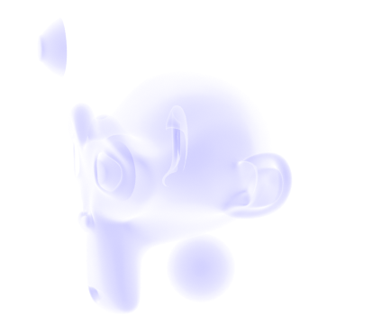
I tried using the alpha blending mode Hashed first. But I had that the problem of the interior’s faces being visible. That makes a more even silhouette, except that the lines of the front highlight the hole, making it appear more 3D. Hashed is also much noisier; even when I rendered with high samples it appeared grainy.
Note that this image is from behind, not flipped.
With backface transparency.
I also found the transparency worked too well this way; you could see through the model from one side and out the other. Looking at it from behind, I could see the eye that should only be visible from the front. Thinking of it as something to imitate 2d, this is very wrong; a silhouette in 2d is just a flat shape without depth. You should only be able to see the side facing the camera. I tried to correct this by making the backfaces also transparent, but this lead to some undesirable behaviour, too, like the empty eye socket rendering as a hole. Although, to have it both ways there is impossible, and ideally I wouldn’t have any backfaces showing to the camera to begin with.
In any case, Hashed turned out to be insufficient, so I tried Blend, but it has the same problem. It’s less noisy, at least. I suspect my colour ramp controlling the Alpha is at fault for being too weak, in part. But I need some method to get rid of the faces on the other side of the object; to hide what shouldn’t be seen.
Blend mode.
The blending factor.
After that, I experimented more with how I was making my silhouette, for a change of pace.
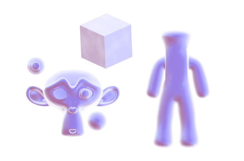
I have another method besides the Fresnel to product the rough shape of an object, using the Normals and Location/Position. I quite like the way this one looks. It’s soft and easy to work with. It’s not as specific as Fresnel or Layer Weight on the edges, which makes it easier to make it look 2d. But that’s also a disadvantage; I have do more to make it match the basic shape of some objects. The rough person-shape I made on the right, for example, has much less colour on the limbs. I also found this wasn’t compatible with my current method of texturing the edges, so they’re too smooth and perfectly neat.
It subtracts the Location from the Position so that when it’s moved in the world the values won’t change. The Scale vector is plugged into Normalise from a previous setup I forgot to disconnect. The cross product with the incoming is what allows it to change with the view.
In the end, I concluded that that doesn’t work for me at the moment. It’s too incompatible with previous node groups I’ve made, and I’d like to be able to reuse them as much as possible. It’s also too much work to make that into a generally accurate silhouette. The trouble with the Fresnel method, on the other hand, is that it starts out too accurate and has to be manually modified.
My current stage of the shader, part-way through modification.
I could use a simpler mesh and the Data Transfer modifier with weights to give a simpler silhouette, but it increases the amount of work to make a character, or other object a default Fresnel edge won’t work well on. I’ll continue to look for methods to improve it.
A few month few months ago, after having used Cycles for a while, I was frustrated by its lack of support for NPR features. Being designed for realistic rendering, it didn’t lend itself well to stylised renders. But I came across this post in a thread on BlenderArtists, which inspired me to consider ways to use the compositor.
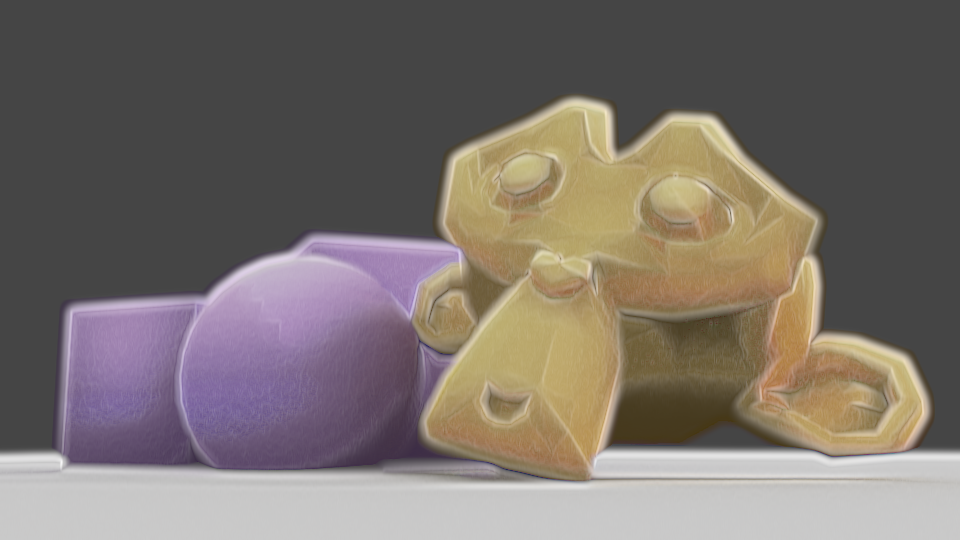
A watercolour and pencil render using Blender’s compositor, by System on the BlenderArtists forum.
So I spent a few weeks trying to work out various ways I could use it. My aim was to create a painterly style, or some approximation of it, using the compositor.
My own replication of that technique.
I started by replicating that affect to familiarise myself with it, then doing my own thing from there. After having spent several weeks trying different thing, I came up with my own effect, and became very familiar with the advantages and disadvantages of using the compositor to create NPR renders.
The advantages:
Compositor changes are relatively quick, and don’t need you to re-render an entre scene, saving a lot of time.
Compositor changes allow you to affect the image as a 2D render, rather than having to work out how to make things work in 3d.
Compositor changes allow you to use some functions that aren’t available for shaders, such as Dilate/Erode, Sharpen/Soften, Sobel, etc.
Using the Compositor allows you to texture an entire image in one go, rather than having to apply it to everything.
Allows access to many render passes, allowing you a lot of flexibility.
The disadvantages:
Each change takes several seconds to show, particularly with complex compositing.
One size especially doesn’t fit all; different scenes, such as bright, dim, interior, exterior, may require significant changes to the compositing to look good, or even maintain a similar appearance.
No convenient way to control the main and shadow colours of individual objects.
Any change, such as rotating a light, changing size, character posing, etc, will require being re-rendered before the compositing can be tweaked; an issue with shaders, as well.
Inconvenient to pull from one file to another; shaders on a 3d model would just come with it when appended.
Entirely after the fact; it’s manipulation of render passes after they’ve been rendered to try and change them into the desired result, rather than a shader-based method which would likely be designed to ensure the renderer gives the correct result each time.
After a lot of experimenting, I was able to come up with this render of a 3d model I made of Mirror! Ryou, an au version of a Yugioh character that my friend Milliekou and I came up with.
Mirror! Ryou, rendered in Cycles, modified in the compositor, using Freestyle for the lines.A gif showing the key stages in my compositing. This model is old now.
My process starts by doing the usual render.
Then, I get the shading Value by dividing the Value of the original image by the combined Value of the Diffuse, Glossy, etc, passes, which I can use as a factor later.
Using the Ambient Occlusion pass and Dilate/Erode nodes, I make a mask and mix the background colour with the original colour of the mesh to fill the general shape of the character, giving it soft edges.
I also got the light colour on the object, multiplying it with the original colours and then using the shading Value through a colour ramp to make the main shading on the model. I also used the Dilate/Erode tool to make it less perfectly accurate, as perfectly accurate shading is a dead giveaway.
For some texture – a key element, I’ve found, of making something look imperfect and not like a 3d model – I massively sharpened the original shading Value, dilated it, then used a Sobel filter, giving it many rings, that I then multiplied the image with to create some texture and imperfection.
I made some errors here; his belt, for example, should be glossy, but I didn’t combine the passes correctly. But overall I’m pleased with the effect, and would like to replicate it in the future. I want to make it more reliable to be able to make lots more images with that style and perfect it. Although, I’m currently waiting for Blender 2.8 to come out official and get more render passes; being able to replicate this with Eevee, if possible, would be extremely helpful. In the meantime, I’m experimenting against with NPR shaders using it, as it allows many more options. I’ll have another post later about my results with that, and hopefully some more actual art. Ultimately, I’ve found the compositor warrants more investigation, and can be a powerful tool, as long as you realise you’re working around Cycles, not with it.