Dragon Knights And Perfectionism

I’ve been having quite a problem making things for a while.

I like to sculpt, and work on new NPR techniques, and I want to show the ships and characters I like well, but in the end, I haven’t ended up posting anything in a long time. I ended up stuck in a crappy perfectionist mindset, always revising or redoing things, or procrastinating from them because I was afraid of getting it wrong, or that it wouldn’t be good enough. But because of that, I didn’t do anything. I don’t have anything finished to show for my sculpting and shaders. But I was encouraged by my friend recently to try and dial it back, and do simpler things and work my way up, and to try and work on my perfectionism, so I’m trying.

I’ve started with chibis. They’re a lot simpler to model and rig than realistically styled characters. I’ve also been finding they’re easier to shade, to an extent; it might be because they don’t have as many bulges and creases and things that can go wrong and look incorrect. Still, I wasn’t able to make them look the way I wanted them to yet. My shaders need more work.

But, I made something. It feels good to have done that, at least.

Millie and I were talking about our Mirror! AU, in which traits of Yugioh characters are reversed, resulting in very different relationships. Jounouchi and Kaiba (we call him Seto in that au, since he prefers to be friendly and warm) are friends, and we had a headcanon that Jounouchi and Seto game together. Millie also made a cute comic about it. It inspired me to imagine them playing an MMO or something together as Dragon Knights, similar to the Dragoons from Final Fantasy.
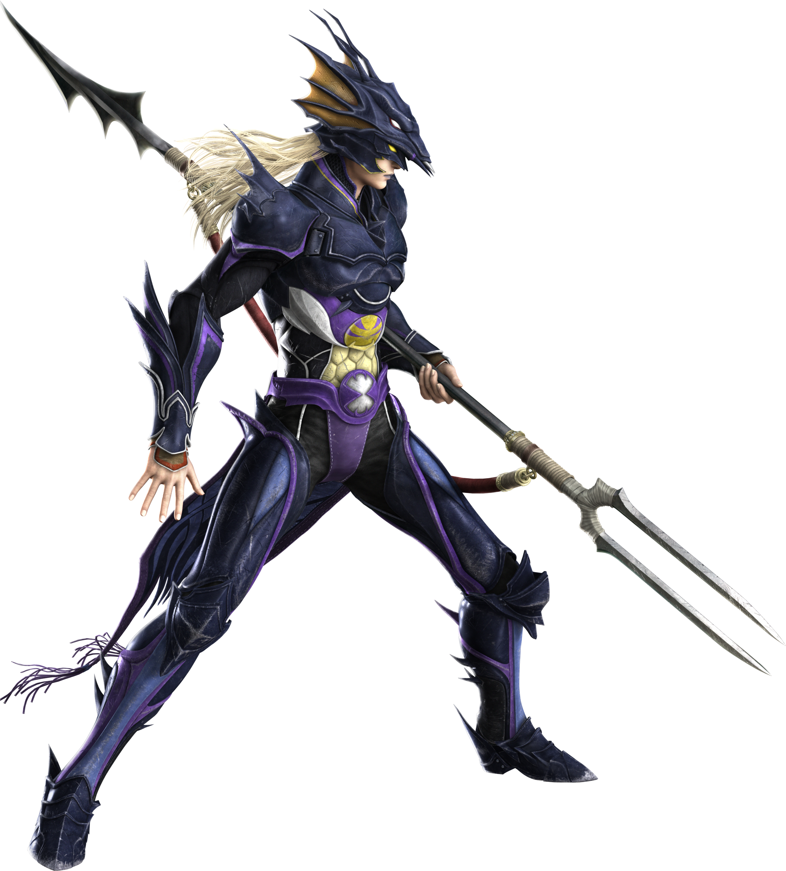
Since their signature cards in Yugioh are the Blue Eyes White Dragon (BEWD) and Red Eyes Black Dragon (REBD) I designed them to be reminiscent of those, and similar to the Monster World figures from the manga and Toei anime’s Monster World arc.

My design for Dragon Knights Seto and Jounouchi. I’m not a skilled 2d artist.

Then I modeled and rendered them. I’m not very happy with the render, but it’s something; I’ll have to play with their shaders some more, and learn to make environments. Even a very simple one, like the grass they’re standing in was unfamiliar to me. I’ve spent so long doing characters and being a perfectionist about them, I’ve neglected other areas.

I’m not very satisfied overall with it, but I’m glad I finally did something. I’m grateful to Millie for pushing me to do something like this. I’ll also make a post for myself about what’s currently going right and wrong with the shaders, and what I want to do to improve them. I’ll try and build momentum and make more things, too.

NPR Shader Experiments 01

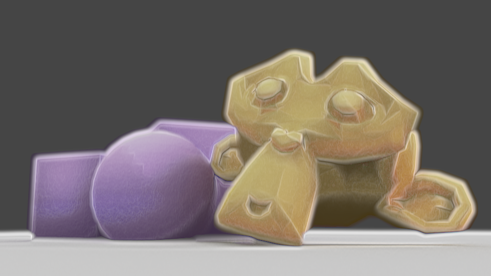
I’ve been experimenting for the last few days with more shaders, using Eevee in Blender 2.8. I started trying to replicate my previous compositing effect, then ended up doing something a bit different.

As I can’t use Dilate/Erode with shaders to get a soft edge, I used a Layer Weight node. I wanted to use the Bump node to modify the normals to gain control over how that turned out, using vertex paint to define which normals are bumped, but it ended up displaying incorrectly, so my current solution is to use vertex paint to add or remove colour from the initial appearance, with a second set of vertex paint to modify the shading. I like this method better than using modified normals; I can directly control it, rather than just having to change normals and hope the outcome is correct, or having to change them frequently depending on the lighting or model angle. However, unlike Blender Internal, I can’t currently get a difference in the shader between its own shadows and shadows cast on it by other things, so if I modified the shading for being ugly in an area shadowed by a second object and itself, it would erase the other’s shadow, looking incorrect.

But, if the AnimAll addon is upgraded to work with Blender 2.8, the vertex data will make it animatable, meaning I could easily fix shading every frame. Currently, that addon isn’t compatible with Blender 2.8, though.

I also used a small amount of bump mapping to add a little bit of inconsistency and texture to the models; complete perfection in the shading is a big tell of 3D. I also used a noise texture on the edges of the Layer Weight’s result, to make the imperfect.

I have to work more on this; I think it’s better to combine some of the vertex paint effects, for one. If I’m changing the shading, it should also effect the edge. As it stands, shding that’s removed doesn’t overwrite the original Layer Weight result, so it can cause areas to exist that look too dark next to modified shading. Also, I need to see how it works with different colours. Past experiments have shown dark colours, high saturation, low saturation, behave differently, so I may need to modify how strongly they’re visible according to those to make it look good. I’m making progress, though. I’ll also experiment with applying this to proper models instead of test models, since the purpose is to be actually usable.


Mirror Ryou and Painterly Compositing

A few month few months ago, after having used Cycles for a while, I was frustrated by its lack of support for NPR features. Being designed for realistic rendering, it didn’t lend itself well to stylised renders. But I came across this post in a thread on BlenderArtists, which inspired me to consider ways to use the compositor.

A watercolour and pencil render using Blender’s compositor, by System on the BlenderArtists forum.

So I spent a few weeks trying to work out various ways I could use it. My aim was to create a painterly style, or some approximation of it, using the compositor.

My own replication of that technique.

I started by replicating that affect to familiarise myself with it, then doing my own thing from there. After having spent several weeks trying different thing, I came up with my own effect, and became very familiar with the advantages and disadvantages of using the compositor to create NPR renders.

The advantages:

  • Compositor changes are relatively quick, and don’t need you to re-render an entre scene, saving a lot of time.
  • Compositor changes allow you to affect the image as a 2D render, rather than having to work out how to make things work in 3d.
  • Compositor changes allow you to use some functions that aren’t available for shaders, such as Dilate/Erode, Sharpen/Soften, Sobel, etc.
  • Using the Compositor allows you to texture an entire image in one go, rather than having to apply it to everything.
  • Allows access to many render passes, allowing you a lot of flexibility.

The disadvantages:

  • Each change takes several seconds to show, particularly with complex compositing.
  • One size especially doesn’t fit all; different scenes, such as bright, dim, interior, exterior, may require significant changes to the compositing to look good, or even maintain a similar appearance.
  • No convenient way to control the main and shadow colours of individual objects.
  • Any change, such as rotating a light, changing size, character posing, etc, will require being re-rendered before the compositing can be tweaked; an issue with shaders, as well.
  • Inconvenient to pull from one file to another; shaders on a 3d model would just come with it when appended.
  • Entirely after the fact; it’s manipulation of render passes after they’ve been rendered to try and change them into the desired result, rather than a shader-based method which would likely be designed to ensure the renderer gives the correct result each time.

After a lot of experimenting, I was able to come up with this render of a 3d model I made of Mirror! Ryou, an au version of a Yugioh character that my friend Milliekou and I came up with.

Mirror! Ryou, rendered in Cycles, modified in the compositor, using Freestyle for the lines.
A gif showing the key stages in my compositing. This model is old now.
  • My process starts by doing the usual render.
  • Then, I get the shading Value by dividing the Value of the original image by the combined Value of the Diffuse, Glossy, etc, passes, which I can use as a factor later.
  • Using the Ambient Occlusion pass and Dilate/Erode nodes, I make a mask and mix the background colour with the original colour of the mesh to fill the general shape of the character, giving it soft edges.
  • I also got the light colour on the object, multiplying it with the original colours and then using the shading Value through a colour ramp to make the main shading on the model. I also used the Dilate/Erode tool to make it less perfectly accurate, as perfectly accurate shading is a dead giveaway.
  • For some texture – a key element, I’ve found, of making something look imperfect and not like a 3d model – I massively sharpened the original shading Value, dilated it, then used a Sobel filter, giving it many rings, that I then multiplied the image with to create some texture and imperfection.

I made some errors here; his belt, for example, should be glossy, but I didn’t combine the passes correctly. But overall I’m pleased with the effect, and would like to replicate it in the future. I want to make it more reliable to be able to make lots more images with that style and perfect it. Although, I’m currently waiting for Blender 2.8 to come out official and get more render passes; being able to replicate this with Eevee, if possible, would be extremely helpful. In the meantime, I’m experimenting against with NPR shaders using it, as it allows many more options. I’ll have another post later about my results with that, and hopefully some more actual art. Ultimately, I’ve found the compositor warrants more investigation, and can be a powerful tool, as long as you realise you’re working around Cycles, not with it.