I haven’t posted in quite a while. But actually, I’ve been sculpting a lot recently.
Around the end of this last year, I think I reached a breaking point with my perfectionism. It got to be so frustrating. Back when I started taking sculpting seriously, I was always wanting to get better. To make what I could sculpt match what I could imagine. But, because of that, I got frustrated time and time again. I was constantly scrapping things, and redoing them, and then scrapping that, too. And then I would hate myself for not finishing it, but I’d hate myself for what it was and think it wasn’t worthy of being finished anyway. Thinking back…It was a very toxic cycle. I don’t know if I can say I’ve escaped that. But…I am trying.
I felt like making some Digital Devil Saga fan art a while ago. I made a model of Serph, and some sketches of others. Serph, being the leader and player character, I decided to focus on first and use for practice. I’ve actually learned a lot from this.
For starters, I used one of my base meshes again. I think I improved a bit on the legs, but they’re still not good.

I had a lot of trouble making his armour. Clothes in general, I’m not very experienced with. Let alone armour that doesn’t exist in real life. I ended up researching quite a bit on ways ZBrush artists make them; I ended up finding different, potentially better ways I could have done them after the fact, gah. I ended up having to do some elements in Blender, mainly those round elements. I don’t know what they are, so I couldn’t reference well. The jacket was also a challenge; it’s symmetrical in overall shape, but the zip goes across it diagonally rather than down the middle. Fortunately, ZBrush had just updated with a slice tool for the Zmodeler, so I was able to use that to cut the zip in. I used Zbrush’s default stuff for the zips, but I don’t like to do that, so afterwards I looked it up and learned how to make my own. Next time, I’ll use those instead.
The armour isn’t well done, honestly. The polygon density is all over the place; just compare the jacket to the sleeves, or the boots. It feels tacked together, which it kind of was. I felt clumsy trying to model it. I need to gain experience and skill with that, and make a better go of it next time I make clothes and armour.
I did try some different things this time, though. I found the Zremeshed model was too dense and slow, so I needed to keep detail, but on a lower poly mesh. I found out I could use a tool to draw lines on the model and convert them into polygroups, and use those to help guide the remesh, so I tried that.


It was actually quite effective. I’ll need to play with it more next time and see if I can learn how to make it tick most effectively. I think a careful combination of that and Zremesher guide lines should give a good result. I need it to be relatively low poly; Blender, since 2.8, doesn’t have great performance.
On another note, I tried something different with the shading, too. It seems, in the NPR community, people either use Abnormal or the data transfer modifier right now to get good shading. But, Abnormal is too slow for me to use on anything like this. And the data transfer…It is handy, but I can’t get to like it. It’s so…Uncontrolled. You just have to hope it gives you what you need. And, because it’s going off of geometry positions, you can’t really do anything that’s too far away from it, or super wonky. Limits.
So, this time, I tried painting vertex groups and using the Normal Edit modifier.

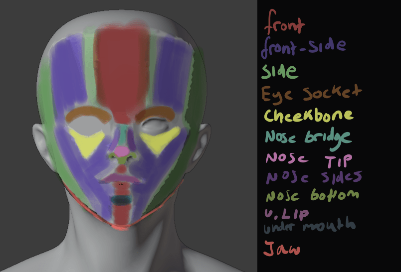
Each group was related to a vector. It’s a bit similar to what anime-style NPR artists had done, but they can get away with a bit more, because they’ve been using simpler, generally more moe, styles. But building straight into your topology has problems; if it’s simple in or out of the vertex group, it has a hard edge, so the light will suddenly snap. And if you use any gradients with it, you’ll have an area that gradually lightens as the light is rotated, but where the lit area remains all the same, looking unnatural.
Those also can get away with a bit more. Like using one vector for one side of the face, and one for the other; in a cel-shaded style, a sharp crease in the middle of the face isn’t necessarily so bad, but not good here, so I had to make several. A front, front-side, and side. I could make even more if I wanted to, but I think blending between those is enough.
By using weight paints, I could give it smooth shading at the end. While I was working on it, I used a hard-edge weight paint brush; no need to make it smooth by blurring until I knew it was going to be good. Although, next time I could build the shapes into the topology a bit, too, and just smooth out their edges. Although I’m not too fond of that idea; it seems like it could mess with the deformation in animation.
It took a while, since it’s my first time trying this method, but I was satisfied with the results.

I really liked the face shading here. Although, it’s difficult to get it right from all angles.

I also did some normal editing on his armour; this is an incomplete version, which you can tell from the face being non-smooth. On the armour, I tried for a bit of a simpler version. Just a front, back, left and right group. I think it made it more prone to being dark, though. I tried to follow the shape of the armour. I’ll have to practice this more. But, I liked how it came out, mostly.
I’m also on V10 of my shader. Right now, I’m using Toonkit for Cycles. It’s convenient in some ways. It lets you isolate the shading of a specific light, and it lets me use an outline, which I used to make a softer edge, that won’t mess up like fresnel.

The trouble is, as it’s cycles, it’s a lot slower. It also doesn’t give me any way to account for reflections, unlike Eevee. I think I could replicate it in Malt/BEER using GLSL, given a bit of time, but I tried it and the performance was shockingly bad. It seems my computer’s VRAM is way lower than it should be.
Ultimately, I was very disappointed, though. I had trouble rigging it, and just got frustrated and finished it so I could be finished.

It just looks bad, sigh. I couldn’t control the linework well, and after baking the normals to textures, they had some artifacts. The face doesn’t look good now – maybe in part because of the colours – and it’s stiff as fuck. And because it was Cycles, it was difficult to see these things before rendering. Plus, some of them probably would’ve gone away if I’d used more samples, but it would take hours to render. I need to investigate more and find a solution.
Lightning Boy Studio released their shader for Eevee. It’s quite good.
I don’t intend to buy it, though. I can already do pretty much everything it can. But, what catches my eye is how it can isolate different lights. I’d known for a while it’s possible using drivers, but I don’t like to use them because it means you have to either keep one light with one character no matter what you do, or go to the hassle or resetting it every time. But, being able to do that in real time would be very convenient. The trouble is, Eevee still has no way to give me the outlines I need. I don’t really want to drop that feature, because it’s important for getting an uneven edge and making things look less 3d without compromising the linework with actual displacement. But, it’s worth looking into. I want to isolate lights, but in a way that minimises the work I have to do. One or two clicks would be best. Although, my shader in general seems to choke Eevee, so even if I could do that I’m not sure how much good it would do.
All in all, I’m frustrated, but I still have goals. I want to make another model. And then another one. And another one after that. Each time, I can learn. I can make the next one better. I want to make the next one better. I don’t want to be bogged down hating myself and what I’ve made anymore. I’m not really one for new year’s resolutions, but I do want to make a lot of art this year.
I’ll make another model of Serph when I’m a bit better. A better one. But not now. Not scrapping this one to do it.


