Recently, I’ve been frustrated with my shaders.
None of them look the way I want them to. I’d like to achieve a painterly appearance, or watercolour, but they’re quite elaborate. I sometimes think it would be better if I could settle for cel shading, but I just can’t accept that. Or rather, I want to be able to do more than just shade everything so simply. I’m not one of those people who’s interested in NPR primarily, or purely, to replicate the style of anime. It’s not that I look down on that style; it’s just not my preference.
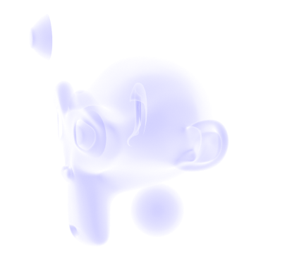
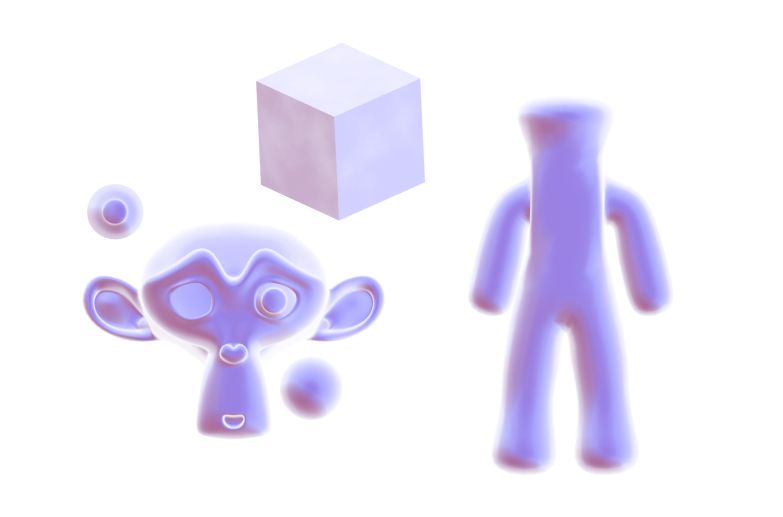
So, I’ve been doing more research, as usual. The big problem with using Fresnel or Layer Weight to make the rough shape of the object, or an outline, is that it can give unwanted lines, and does. I dislike having to manually correct these, so I’ve been trying to think of ways to fix this. I’ve experimented the day or so with blurring the normals of the model to remove details.
How did I do this? Well, I’m not blurring the normals, exactly. I came across this video a while back. One of the features demonstrated is creating a false blur by distorting a texture.
I’d hoped I could apply the same technique straight to the normals, but it didn’t work. Instead, I baked the object’s original normals out to an image, and used that method to distort it.

The result was effective, actually. I haven’t removed anything from the default Suzanne head, but by blurring it and using it as the Normal input, it’s removed the detail. It also darkened it for some reason, which I was able to compensate for by remapping the value by an equal amount to the distortion. I’d hoped to use this to get a blurred version of Fresnel I could use to make a better silhouette. However, when I tried it..


It only works from the front. I really don’t know why this is. My best guess is that it’s something to do with the normals’ texture. The colours don’t appear the same way when I look at them as the original normals do, so perhaps it’s a reason why it doesn’t display right. However, when I used it as the normals without blurring, it displayed correctly.
It’s quite frustrating. But at least I learned I can blur out detail with this method. That’ll likely come in useful.
The advantage of this method is that the original normals are a texture that isn’t being permanently modified, so it can be controlled as I please.
The disadvantage is, it’s grainy. I haven’t found a way to smooth it yet, though, for what I’m doing, a bit of grain may help it appear natural. Also, as it’s just using the original normals from a texture, it can’t be modified the way the real normals of the geometry can.
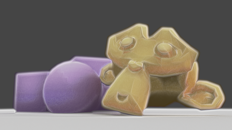
On another note, I came across an interesting method for modifying shading.
This one uses an image texture to paint on to control shading. The trick is to create a UV slot on the objects you want to modify, and then use the UV Project modifier to project UVs, like the Project From View UV mapping option, but in real time. Then, have an image texture using that UV to control the shading by adding or subtracting. As they’ll all reference the same image, you don’t need to select individual objects to control, and can modify everything in the shot at once.
The advantage of this method is that you can control them all at once as long as they’re referencing the texture. Additionally, if you make it the same resolution as your render – and you probably should – it shouldn’t appear pixelated. And since it’s an image, you could also edit it externally if you really needed to or wanted to. I find this method far more responsive as I paint than modifying vertex paint, and it can be far more precise than vertex paint would be on most sensible meshes. It’s extremely effective for cel shading.

The disadvantages are several. For one, it’s an image, so it’ll bloat your file size, potentially a lot if you’re rendering at high resolution. Also, because it’s an image, you can’t animate it the same way you could the vertex paint method; you’d have to use an image sequence, increasing the file size further and manually repainting each frame. Although, if replicating anime, that may be best, as it’s essentially what colouring in anime is like, and leaves room for human errors that make it appear more genuine. Lastly, if you change anything in the shot, you’ll have to repaint. Depending on the change, this can be small or large; if you move the camera, you’d have to redo the lot, or, if you were just panning, perhaps you could compensate using the Mapping Node or translation method. That makes it tricky if you want to change the camera angle or re-pose a character or such, though if you modify the shading last, it shouldn’t be as much of an issue. It’s also more difficult to make look natural on something with smooth shading.
Overall, I find there are advantages and disadvantages to this method, but it’s certainly something I’ll keep in mind. I might well use it next time I’m doing a render; I prefer the flexibility of vertex paint, being able to modify things after the fact and the shading changes not be rendered all worthless…But the speed and precision of this texture method isn’t something I can ignore. Custom shading is very likely the key to convincing 2d, or at least an essential.
Anyway, that’s what my research and testing has turned up for the moment. I want to experiment more. Reading a reference from an old Siggraph paper, Painting With Polygons, Video Watercolorization using Bidirectional Texture Advection gave me some ideas; that’s actually where my idea to blur the normals came from. It also seems several steps of their process are ones I’d used in my earlier compositing technique, though applied differently. I’ll try experimenting more and see what I can turn up.